Without further ado I bring you:
Comments on this entry are closed, you will find enough opportunity to comment on my new blog. I give all the controls back to Dan. My time here has been a blast — more on that later. For now: enjoy!
Without further ado I bring you:
Comments on this entry are closed, you will find enough opportunity to comment on my new blog. I give all the controls back to Dan. My time here has been a blast — more on that later. For now: enjoy!
It’s 3:00AM and I just spent 2 hours fixing a bitmap font (pixel) to display correctly in my Flash movie. I eventually solved the problem. Thank god, because I think I was going mad. Here’s what I did to avoid a few notorious problems.
You got your nifty font all ready and suddendly Flash is not being nice and diplaying it all blurry. Yuck. It turns out that when a text field’s X and Y stage coordinates are non-integer values (for example X: 102.4 and Y: 301.3) the pixels at the edge of the font suffer from over anti-aliasing. You can read more about it in a Flash TechNote. The solution is pretty simple: just change those nasty non-integer values to nice integer values. This was somewhat of a “duh” moment — when reading the TechNote I remembered this oddity (the document dates from 2001 for crying out loud.) Additionally Fonts For Flash has a useful user guide to help you make sure those bitmap fonts display as crisp as they should (note: they carry a nice selection of bitmap fonts for sale.) Good, time to move on.
My problems were far from over. The first problem was solved in a mere 5 minutes. A little Google here and there and you’re ready to get going again. But then suddendly some characters of my font filled themselves where no fill was intended. Compare the two images below.

Now, obviously situation A totally sucks. Useless. Before I go on I must add that this was a bitmap font I edited and changed myself using Macromedia Fontographer, an application I’m not terribly familiar with. I didn’t like some specific letters. However only “R” and “D” were giving me trouble (i.e. filling up) and I didn’t touch those — go figure. Anyway, to be honest I had no clue what was going on. I redesigned both letters, but alas without satisfactory result (I was doing something wrong obviously.) After doing some research I came across a tutorial at Ultrashock.com on this very subject. I was saved. I correctly edited the letters that were causing the pain and it automagically all worked perfectly as shown in situation B.
I feel a bit silly for my lack of knowledge in this specific case — it’s not like this is an extremely recent problem or anything (more like known for ages.) I guess I never really used bitmap fonts much in Flash and if I did, I was a lazy bum and would import images (which is obviously a big no-no considering file size and dynamic text fields.) Anyway, I hope my ignorance will help you with future projects and lead to less frustration and time loss. I’m going to bed and dream about bitmap fonts in Flash and world domination. Catch you later.

15 seconds. That’s the amount of time Ullrich lost today to Armstrong. Not much, right? True. But this is not about the amount of seconds as such — this is about the psychological effect. This fact aside, the big question of course is: will Armstrong win a 6th Tour. Will he be the first to break the mythical 5 Tour de France victories? Legends such as Anquetil, Hinault, Merckx and Indurain all failed at their 6th try. Personally I will be rooting for Ullrich. Not because I do not like Armstrong or think he is not entitled to win a 6th Tour, but simply because I prefer Ullrich’s style of cycling and personality.
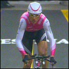
Yet, today Armstrong did not win the prolog — as usual I would say. It is a pain to wear the yellow jersey the first week and US Postal knows it. Armstrong would rather have other teams control the race, have them do the sprints etc. Could he have won? Probably. Not important anyway. He did his job. Surprisingly enough, a young (23) Swiss fellow named Cancelarra won. Another interesting fact is the amount of Americans in the top 20, namely 6. That’s a good thing for the popularity of cycling on the other side of the pond.
So, my favorite sporting event has started. 3 weeks to enjoy, especially the last week where everything will be decided. I will not be blogging the Tour as such, maybe an occasional post, but I doubt even that. I will be enjoying the event on TV and maybe even drive to the French Alps to view a stage live. Check out the stage standings and stage cities description and detailed itinerary.
Holland lost tonight against Portugal. 1-2. I must admit that Portugal was definitively the stronger team especially during the first half. Before I go on I have to say that we were dealing with a classic case of a home referee. Scandalous. Sure it is no excuse but I have never seen so many free kicks going to the home team — ass hole. All in all I think reaching the semi-final was not that bad for Holland.
Holland’s biggest problem was, as usual, playing position. We lost the ball many times in the center. Long balls to the front and fingers crossed that some player, such as Makaay (who was brought in at the start of the second half) or Van Nistelrooy might be able to control it and get a shot at the goal. It never happened. In the second half Holland played more aggressive and I really felt that things would happen. Then Portugal was unlucky and Andrade diverted the ball in his own goal. 1-2. The pressure was on, but Holland never got a good shot at it. Goalkeeper Van der Sar had some terrific saves, if it was not for him the score would have been much worse.
Now Holland needs to get ready for Germany in 2006. The world cup. We have a decent team and the youngsters will need to prove themselves. But with people like Robben, Van der Vaart, Sneijder, Heitinga, Bouma and others I think we will be a team to watch. Let’s just hope we can avoid the South Korean fiasco two years ago (we did not qualify…)
One of the things that keeps me very busy at the moment is writing my thesis,
being a mandatory part of getting my master’s of science degree. I have
a background in Economics but convinced the faculty that design is an economic
entity of importance, especially related to high technology, marketing and branding.
The task was not easy, design is traditionally, within the academic field of
Economics and Business, not looked upon as being a strategic element. Naturally
I begged to differ. Anyway, I was blessed with a supervising professor that
“gets it.” He’s not a designer but a marketing guru, yet he
talks about Apple and Target and the way they used design to differentiate their
offering from competitors. Whenever I have a discussion with him he reminds
me of the fact that design matters, now more than ever.