Year: 2004

  • When Good Design Falls Into The Wrong Hands

    Let me tell you a little story. It’s about a client who decided to end a project early, before all the work was completed, so they could take control of the finished product. All work was paid for, as-per the contract, so no complaints, right?

    Wrong.

    Almost four months after handing over the project files to their IT department, along with clear instructions (not that many were needed, since the layout and markup were fairly straightforward, as was the CSS), we receive an email letting us know the site was finally live. “Terrific!” we thought, “Now we can link to it and show off some more recent work!” Then we clicked the link.

    Horror. Disbelief. Shock. Page after page, bastardized–results Dr. Frankenstein would be proud of. A monstrosity wrought not on the operating table, but within Adobe GoLive, and at the hands of what can only be assumed is a madman (or even worse: an entire team of madmen).

    Gaze in horrified wonder at the accessibility statement, rendered false by the mangling of markup and navigation. Stare with morbid fascination at the once text-based navigation now rendered as images. Run crying from the room when you see the body text, once styled and pure, now stark naked and barren.

    Is this a work of fiction? Sadly, no: you can view the ghastly reality right here.

    “But wait!” you scream! “What did the original, unfinished site look like before it was rendered helpless by these monsters?” Well children, I’ll show you…just peek behind this velvet curtain…

    As we grieve for our loss, it would make us feel better if someone, anyone would share with us their stories of similar atrocities and client-committed crimes against design, so we might find some comfort.

  • More Noise Is Better

    Last week I was watching a German television show (they actually do have worthwhile programming at times) which investigated and tested noise levels of household appliances such as vacuum cleaners, dish washers and kitchen robots, among others. Generally I would conclude that the less noise these various machines made the better. Yet, user research indicated that a vacuum cleaner, for instance, which made less noise was perceived as less powerful and therefore less effective. Odd, is it not?

    Towards the end the research concluded that some product characteristics are so fundamental to the (positive) value assigned by users that removing (or reducing) them will translate into a negatively affected perception. There is an interesting line to be drawn to design and usability. However the question remains how this would apply to user interfaces and web design in general. I’m still trying to see what role user expectation, accustomedness and perception play and how some assumptions designers make can have an opposite effect. Can you think of any analogies similar to the vacuum cleaner case, but applied to user interfaces or web design?

  • How To Design User Interfaces

    Note: the image below was posted as a bit of an experiment, with tongue firmly planted in cheek, following a brief Photoshop skirmish between Didier and me. While no one has complained, I have one thing to say just in case: Zeldman, please don’t kill us ;-)

    How To Design User Interfaces

     
  • Syntax, Semantics and Pragmatics in Hypertext Documents

    What are we talking about? Semantics is a topic that has been much discussed
    last year and still remains an important issue (although it’s becoming
    somewhat of a buzzword. Hype or reality?). This post is not aimed at discussing
    the value or importance of semantics as such, but rather its general framework
    and its application to hypertext documents and web sites in general.

    Semiotics

    Semiotics is commonly known as the general science of signs. Semiotics is composed
    of three aspects: a syntactical aspect (syntax or syntactics), a semantic aspect
    (semantics) and a pragmatic aspect (pragmatics).

    Syntactics (Syntax)

    Different forms of data exchange are constituted of signs or combination of
    signs (language, code, non-verbal signs — among others). Syntax defines
    a set of rules to be applied when exhanging data, thus “the relationship
    of signs to what they stand for”. Breaking these rules results in a syntactical
    disturbance. An example of this type of disturbance in human data processing
    are spelling errors.

    For example, using an element spelled <stronk> instead of
    <strong>. But also ommiting a closing tag on empty elements
    such as <img>. The related DTD
    (Document Type Definition) or more recently a Schema
    (XML)
    contains the rules that define the correct spelling or application of (the signs
    that constitute) an element (note: in XML the number of elements are unlimited).

    Semantics

    Semantics applies to the meaning of data. When exchanging data sender and receiver
    will have to assign the same meaning to particular (combinations of) signs,
    thus “the relation of signs to the objects to which the signs are applicable”.
    If this condition is not respected a semantic disturbance will occur. An example
    of the above mentioned disturbance is a discussion between two individuals not
    being able to understand each other.

    The meaning (or context) of specific elements is what we commonly refer to
    as the semantic value of code. Therefor the use of <p> elements
    is justified in the context of a paragraph and likewise <hn>
    n{1,6} elements are used to represent headers in a document. Furthermore elements
    have to be nested correctly. For example — in a (X)HTML document —
    an <h1> element can not contain a paragraph. The DTD or Schema
    explicitely contains nesting rules. However it can not evaluate if the context
    of a particular element is semantically correct. Current validators check a
    document for syntactical errors, but remain limited in their aptitude to discern
    issues related to semantics. The question remains if it’s technically
    possible to build an analysis tool spitting out suggestions regarding the semantic
    value of a document. Dan Cederholm started
    a practical initiative known as SimpleQuiz
    — discussing the semantic value of elements in hypertext documents.

    Pragmatics

    This aspect describes the effect a particular signal has on the behaviour
    of the receiver, thus the “relation of signs to (human) interpreters”.
    If the effect is different from the senders initial intention a pragmatic disturbance
    occurs. A suitable example are speed delimiter signs found on most roads, with
    various applicable values. No spelling errors have been made and the data is
    correctly interpreted by both sender and receiver — yet some drivers ignore
    this signal by speeding.

    Pragmatics relate to some extend to usability. How will a user (receiver) act
    or react to a given condition, situation or signal (sender). It’s become
    best practice to avoid underlining regular text in documents (emphasis), and
    reserve this practice exclusively for hyperlinks. Abstracting from context,
    syntax nor semantics forbid the above mentioned practice. However, underlining
    text that is not a hyperlink (or ommiting to underline a hyperlink) results
    in a pragmatic disturbance — users expect a hyperlink to be underlined
    (and vice versa).

    Resources:

  • Design and Usability: Part 3

    If the two words design and usability are mentioned together
    you can be sure that user testing will follow within a few sentences
    or paragraphs — at most. But what about the steps taken before throwing
    your design to the lions? Starting a web project implies collecting and defining
    nonexclusive factors that will influence how things will look, feel, communicate
    and function.

    You Don’t Start With Usability Testing

    I’m not talking about user testing (or user needs specifically), but
    rather generic topics that influence the level of interactivity, functionality
    and eventually usability. (Un)fortunately there’s no golden rule or set
    of axioms which can be followed or implemented during the development of any
    given web site or user interface — each project has different requirements
    (on all levels). For example: a news site is not an online shop and a weblog
    is not a search portal.

    Not having a preformatted or standardized list of (all) elements and details
    to implement at your disposal during the design phase, does not mean the entire
    process should be unstructured. I think a collection of global denominators
    can help structure the process and make sure the design fits the purpose of
    the web site (goals). Before I mention some of these generic factors which guide
    and direct (to a certain degree) a design process, let’s look a bit closer
    at how such a process would apply in practice:

    Structure, Guidance and Direction


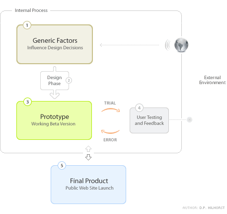
    How Design and Usability Relate

    As depicted above — generic factors originate from external
    entities and variables (i.e. the world). I don’t think many projects
    would end up being successful if internal factors and preferences were to be
    taken into account exclusively. Design and usability flow from a sensible and
    balanced mixture of both internal and external information. Drawing from my
    own experience, discussions and projects with Dan, an academic article entitled
    What
    Is Beautiful Is Usable
    ” by authors N. Tractinsky, A.S. Katz, D. Ikar
    and comments
    made by Andrei
    Herasimchuk
    (who currently works for Adobe
    Systems
    and has worked on the interfaces for Adobe Photoshop, Adobe Illustrator,
    and Adobe InDesign), I’ve come to the conclusion that indeed “the
    perceived aesthetic quality of an object or subject is intrinsically locked
    with how users experience functionality and usability” (adapted from a
    statement
    previously made by Andrei). But I disgress…

    Dude, What About Your Generic Factors?

    I’m confident that every designer worth his salt has already come up
    with a few generic factors that influence design and usability decisions. Design
    and usability are eventually about communication and interaction (HCI).
    Below I’ve summed up some of the factors that could be taken into account
    starting a project:

    • Goals — What are we trying to do, both internally
      and externally? More marketing, more sales, more traffic, improved ROI, minimize
      costs, add value, inform? Know why you are communicating and interacting!
    • Audience — Who are we doing this for anyway? Teenagers,
      seniors, computer savvy, women, high-income, disabled, (or combinations).
      They all have their own characteristics. Know who your audience is!
    • Products/Services — What are we promoting or selling?
      Commodities, luxury products, information intensive objects or subjects, complicated
      services? Know what you are communicating!
    • Technical Requirements — What channels and tools
      will be used? Offline or online? Software, application, intranet, broadband,
      slow connection, mobile? Windows, Apple, Linux? Internet Explorer, Mozilla,
      Safari, Opera, all? Know how you will be able to communicate and interact!

    Above I’ve tried to answer four questions: Why? Who? What? and How? These
    generic factors will enable the definition of how design and usability will
    be implemented throughout the project. Does this mean we’ll get it right
    from the start? Not likely. We’ve merely established a hypothesis —
    we think or assume it might work out as planned. It’s at this
    point that you throw your design to the lions (the beta testers or an external
    pool of users). The latter is a process of trial and error — discerning
    and adapting elements that did not work as expected (back to the design phase
    and prototype) and keeping elements that have a positive or intended effect.

    This Is Not an Exact Science

    Naturally I’ve abstracted some elements or steps in the process. Furthermore
    design and usability are not exact sciences. Thus 1 + 1 often does not equal
    2; it’s more along the line of 1 + 1 equals something you didn’t
    expect
    . Feelings, opinions and perceptions play an important (if not decisive)
    role, but they’re subjective (difficult to structure). The best thing
    we can do is work towards an effective outcome. An outcome that is unfortunately
    constituted of factors, elements and drivers of which most are (partly or completely)
    unknown.

    So what’s your take on the subject? What factors do you take into account?
    Did I miss any? Where do you put the emphasis: aesthetic quality or functionality
    — or is there no trade-off necessary (both being intrinsically linked)?