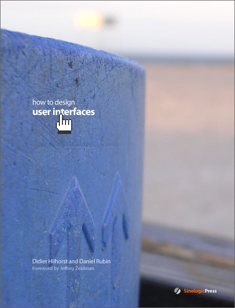
Note: the image below was posted as a bit of an experiment, with tongue firmly planted in cheek, following a brief Photoshop skirmish between Didier and me. While no one has complained, I have one thing to say just in case: Zeldman, please don’t kill us ;-)
Comments
15 responses to “How To Design User Interfaces”
Duuuuuuuuude!
Sweet! I’m picking this one up.
Andrew
Now that is a pimpriffic book cover.
And minimalism again shows why it has no equal.
I would be impressed, and might even buy the book, had you not used the horrific hand cursor that was forced onto the world by Netscape.
The original pixel perfect cursor designed by Bill Atkitson for HyperCard that we also use in Photoshop is, IMHO, the best hand cursor ever designed. All the others are cheap imitations that should be burned at the alter of shoddy icon design.
Smack down on that! 8^)
Andrei, don’t you think your preference is a tad biased? ;-)
Of course, I agree with you completely. We might just have to issue a revised version…
Very nice work fellas! Can’t wait to pick it up! How long’s the wait?
That is one of the cleanest page designs I have seen in a long time. The rough to smooth (forground to background) transition is what does it for me.
Very clean. The author’s names are also very modestly sized.
If it was up to me, I’d be tempted to put ZELDMAN across the top in massive letters. ;)
The image is perfect..and can’t wait till I can pick up the book.
But can i as (sorry if this sounds dumb to you) why would Zeldman want to “kill you” ?
Nice! Don’t forget to put amazon link when it come out – for non-US-buyers : )
I can only assume that Zeldman still doesn’t know he’s going to write foreword – if that’s the case, this would be very original way to ask him and a very funny scenario : )
ooooh I smell trouble. Zeldman will turn into da HULK! ;)
Good looking cover, but for once I hoped to see something not so minimal. Minimal has it’s place but I believe webstandards could benefit from a richer approach. We wouldn’t want people to think that good interface design is purely a minimal affair. The success of companies like 37signals shouldn’t be seen as the only truth.
Egor: I agree that doing something just because other designers have had success with it is not the best reasoning (though following success is not really a bad idea per se), but minimal design has its place, and its followers. The webstandards effort could probably benefit from more rich graphics in its public image, but that doesn’t mean that it won’t also benefit from minimal designs. We happen to prefer a minimalist style, so that is what our work reflects. Our primary goal is to produce well-designed work, whether for an electronic user interface, a corporate identity package, or a book cover — if a project would be better suited by more visually involved artwork, then that’s what we’ll do.
i believe the amigaOS hand-cursor would have been available before Hypercard was released, though i don’t think it was ever a _default_ cursor, as such..
I like the cover, and I think that minimalism is good here. It doesn’t make us think in a certain way, it leaves us space for creation. The only thing I don’t like is the hand cursor, which doesn’r fall into the style. Anyway the general impression is quite good.