If the two words design and usability are mentioned together
you can be sure that user testing will follow within a few sentences
or paragraphs — at most. But what about the steps taken before throwing
your design to the lions? Starting a web project implies collecting and defining
nonexclusive factors that will influence how things will look, feel, communicate
and function.
You Don’t Start With Usability Testing
I’m not talking about user testing (or user needs specifically), but
rather generic topics that influence the level of interactivity, functionality
and eventually usability. (Un)fortunately there’s no golden rule or set
of axioms which can be followed or implemented during the development of any
given web site or user interface — each project has different requirements
(on all levels). For example: a news site is not an online shop and a weblog
is not a search portal.
Not having a preformatted or standardized list of (all) elements and details
to implement at your disposal during the design phase, does not mean the entire
process should be unstructured. I think a collection of global denominators
can help structure the process and make sure the design fits the purpose of
the web site (goals). Before I mention some of these generic factors which guide
and direct (to a certain degree) a design process, let’s look a bit closer
at how such a process would apply in practice:

How Design and Usability Relate
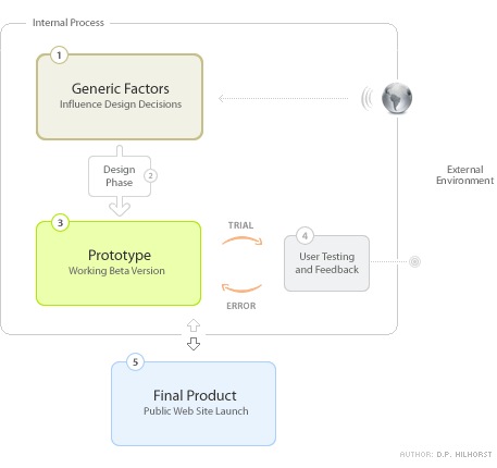
As depicted above — generic factors originate from external
entities and variables (i.e. the world). I don’t think many projects
would end up being successful if internal factors and preferences were to be
taken into account exclusively. Design and usability flow from a sensible and
balanced mixture of both internal and external information. Drawing from my
own experience, discussions and projects with Dan, an academic article entitled
“What
Is Beautiful Is Usable” by authors N. Tractinsky, A.S. Katz, D. Ikar
and comments
made by Andrei
Herasimchuk (who currently works for Adobe
Systems and has worked on the interfaces for Adobe Photoshop, Adobe Illustrator,
and Adobe InDesign), I’ve come to the conclusion that indeed “the
perceived aesthetic quality of an object or subject is intrinsically locked
with how users experience functionality and usability” (adapted from a
statement
previously made by Andrei). But I disgress…
Dude, What About Your Generic Factors?
I’m confident that every designer worth his salt has already come up
with a few generic factors that influence design and usability decisions. Design
and usability are eventually about communication and interaction (HCI).
Below I’ve summed up some of the factors that could be taken into account
starting a project:
- Goals — What are we trying to do, both internally
and externally? More marketing, more sales, more traffic, improved ROI, minimize
costs, add value, inform? Know why you are communicating and interacting! - Audience — Who are we doing this for anyway? Teenagers,
seniors, computer savvy, women, high-income, disabled, (or combinations).
They all have their own characteristics. Know who your audience is! - Products/Services — What are we promoting or selling?
Commodities, luxury products, information intensive objects or subjects, complicated
services? Know what you are communicating! - Technical Requirements — What channels and tools
will be used? Offline or online? Software, application, intranet, broadband,
slow connection, mobile? Windows, Apple, Linux? Internet Explorer, Mozilla,
Safari, Opera, all? Know how you will be able to communicate and interact!
Above I’ve tried to answer four questions: Why? Who? What? and How? These
generic factors will enable the definition of how design and usability will
be implemented throughout the project. Does this mean we’ll get it right
from the start? Not likely. We’ve merely established a hypothesis —
we think or assume it might work out as planned. It’s at this
point that you throw your design to the lions (the beta testers or an external
pool of users). The latter is a process of trial and error — discerning
and adapting elements that did not work as expected (back to the design phase
and prototype) and keeping elements that have a positive or intended effect.
This Is Not an Exact Science
Naturally I’ve abstracted some elements or steps in the process. Furthermore
design and usability are not exact sciences. Thus 1 + 1 often does not equal
2; it’s more along the line of 1 + 1 equals something you didn’t
expect. Feelings, opinions and perceptions play an important (if not decisive)
role, but they’re subjective (difficult to structure). The best thing
we can do is work towards an effective outcome. An outcome that is unfortunately
constituted of factors, elements and drivers of which most are (partly or completely)
unknown.
So what’s your take on the subject? What factors do you take into account?
Did I miss any? Where do you put the emphasis: aesthetic quality or functionality
— or is there no trade-off necessary (both being intrinsically linked)?