- Attitude
or Aptidtude Justin
Goodlett — skinnyj - Revised Pricing Structure
for Movable Type Personal Edition Jason
Kottke — Kottke.org - They Rule ia/
blogs - Technology’s
Too-Small Sisterhood Alex
Salkever — BusinessWeek
Year: 2004
-
Weekend Reading (20)
-
Blogger. Templates. Designed.
Note: My template set has been updated — get the scoop here »
 I’ve been waiting to write about this for months now. Really. Blogger has finally relauched with a snazzy new look courtesy of Douglas Bowman and Adaptive Path. The new Blogger features not only a nicer, rounder design, but also a much-improved process for creating and managing blogs — and a bevy of fresh templates designed by some familiar names.
Brand Name Designers
Doug recruited some terrific designers to design and style brand new, standards-based templates for the relaunch (in addition to the fine templates he contributed), and I was honored to be one of this select group: Dan Cederholm, Todd Dominey, Dave Shea and Jeffrey Zeldman all created some fantastic designs for the new templates (view a list of all the template designs).
Beautifully Generic
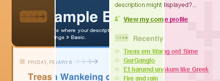
The trick with this project was to design something visually fetching, but not too personal (the primary function is a reusable template, which might display many different types of content), yet individual enough to inspire someone to actually use it.
“Your templates really stand out to me as having a personality while still presenting a ‘generic’ feel…” —Dan Benjamin
My primary goal was to design a base template that would work in many situations, for many different people. The best way to accomplish this from the outset was to limit the color palette to similar hues, which also made it easier to create alternate color schemes that have a fairly different look without having to change any of the base elements:

For the design, I wanted to play a little with gradients, as well as try some layering of background elements in CSS to create subtle effects (as it turned out, they are extremely subtle). I ended up applying gradients to every primary element, though chances are you won’t notice them all right away.
 The subtle gradients gently direct the eye down the page, and create the slight decrease in contrast of the background arrows in the sidebar as they move further down the page (getting closer to the darker color of the gradient).
Standards for the People
The number of people who will make use of these templates is astounding (it’s already started), and the web is going to be a much better place for the effort (just think of the hundreds of thousands of sites that will soon be using well-designed standards-based markup!). I’m very happy with how Thisaway turned out, especially the alternate colors. I think it fits in nicely with the look and feel of the new Blogger (though that was entirely accidental, since none of us saw the design before Sunday), and compliments the other new designs while remaining unique.
Congratulations, kudos and thanks to Ev and the rest of the Blogger crew, as well as Doug and the folks at Adaptive Path for allowing such a terrific team of designers to contribute to this project.
Blogger template questions? Please search and/or post to the official Blogger Help Google Group—you are much more likely to get a response there than by emailing me.
-
When Black Is Not Black
Stop using black for copy text. Just stop. It hurts my eyes. All you contrast freaks, stop telling me that default black (#000) text is a necessity on white backgrounds. It is not, I repeat, it is not. I will stop reading blogs and web sites that insist on defying common sense rules of design, legibility and style. More contrast does not result in de facto better readability.
If you use black (#000) for body text, think again. Think for crying out loud! Change it to #333 right now. Honestly, any value between #666 and #333 is so much better than #000. Oh, and while you’re editing your stylesheet anyway, do Andrei a favour and remove any instance of Trebuchet, especially as copy font. Do I agree with him that Trebuchet must die? No. Do I think it’s not the best font around? Probably. If nothing else I admire his effort to sacrifice for the greater good of Design (yes, that’s spelled with a capital “D”).
But, misrepresenting your own wife. Ouch. Good luck fellow.
On another note I’d like to take the time to congratulate Dan on his wonderful template design for Blogger. Actually, let me just congratulate everyone who worked on the Blogger redesign, especially the folks at Adaptive Path and the talented Douglas Bowman of Stopdesign. Slick job guys! To close off the festivities I’ll point you to Dave Shea’s new corporate home. Sweet stuff, dude!
As it seems, it’s also the day to share a list of people that have influenced one’s design style or thoughts on design. So here we go, in no particular order: Philippe Starck, Rem Koolhaas, Donald Norman, Hillman Curtis, Joshua Davis, Douglas Bowman, Jason Fried, Todd Dominey and Andrei Herasimchuk (yeah, you just made the list, boy). But wait, my list would not be complete without mentioning Dan Rubin, specifically. Actually, I’m sure I forgot to include a bunch of people. Nevermind. Better luck next year. Anyway, I’ll be away for a few days, catch you later.
-
Weekend Reading (19)
- Art
Direction and the Web Stephen
Hay — A List Apart - Understanding
Organizational Stakeholders for Design Success Jonathan
Boutelle — Boxes and Arrows - The
Trouble with Business as Usual Adam
Greenfield — v-2 Organisation - Jumping
Barriers: Using Design to Aid Technology Adoption (PDF) Dan
Saffer — Carnegie Mellon University - News Standards: A Rising Tide of Commoditization
Jo Rabin — XML.com - Et Tu, Brute?
Andrei Herasimchuk — Design by Fire
- Art
-
Navigation Matrix Reloaded
In my previous post, Jon Hicks raised the IE6 flickering issue, which has been tormenting designers and coders alike for too long now. At first I thought there was no elegant solution to this problem, but after a few error and trial sessions I came up with a solution that gets rid of the flickering — in any situation.