Note: My template set has been updated — get the scoop here »
 I’ve been waiting to write about this for months now. Really. Blogger has finally relauched with a snazzy new look courtesy of Douglas Bowman and Adaptive Path. The new Blogger features not only a nicer, rounder design, but also a much-improved process for creating and managing blogs — and a bevy of fresh templates designed by some familiar names.
Brand Name Designers
Doug recruited some terrific designers to design and style brand new, standards-based templates for the relaunch (in addition to the fine templates he contributed), and I was honored to be one of this select group: Dan Cederholm, Todd Dominey, Dave Shea and Jeffrey Zeldman all created some fantastic designs for the new templates (view a list of all the template designs).
Beautifully Generic
The trick with this project was to design something visually fetching, but not too personal (the primary function is a reusable template, which might display many different types of content), yet individual enough to inspire someone to actually use it.
“Your templates really stand out to me as having a personality while still presenting a ‘generic’ feel…” —Dan Benjamin
My primary goal was to design a base template that would work in many situations, for many different people. The best way to accomplish this from the outset was to limit the color palette to similar hues, which also made it easier to create alternate color schemes that have a fairly different look without having to change any of the base elements:
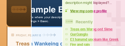
For the design, I wanted to play a little with gradients, as well as try some layering of background elements in CSS to create subtle effects (as it turned out, they are extremely subtle). I ended up applying gradients to every primary element, though chances are you won’t notice them all right away.
 The subtle gradients gently direct the eye down the page, and create the slight decrease in contrast of the background arrows in the sidebar as they move further down the page (getting closer to the darker color of the gradient).
Standards for the People
The number of people who will make use of these templates is astounding (it’s already started), and the web is going to be a much better place for the effort (just think of the hundreds of thousands of sites that will soon be using well-designed standards-based markup!). I’m very happy with how Thisaway turned out, especially the alternate colors. I think it fits in nicely with the look and feel of the new Blogger (though that was entirely accidental, since none of us saw the design before Sunday), and compliments the other new designs while remaining unique.
Congratulations, kudos and thanks to Ev and the rest of the Blogger crew, as well as Doug and the folks at Adaptive Path for allowing such a terrific team of designers to contribute to this project.
Blogger template questions? Please search and/or post to the official Blogger Help Google Group—you are much more likely to get a response there than by emailing me.
Comments
33 responses to “Blogger. Templates. Designed.”
Dan? Is that really you? This isn’t Didier pretending is it?
Nice work by the way! Must be good to finally see it out in the open…
Happy to read you again, Dan!
Terrific work on the templates!
;)
Thanks guys, yes, it is me :)
It’s very nice to see something like this come to fruition — it was a small project compared to most (2 days from start to finish), but the potential positive impact on the web is huge.
BTW Jon, I just love your Thunderbird icon, you astound me again and again :)
but the potential positive impact on the web is huge.
it is!
;)
I like almost all the new blogger templates but I think they look ugly with the google adds above them… maybe its just me but I think I’m right.
Andrew: I agree completely about the banner ads, and I’ve already asked Doug if it’s possible for us to tweak our designs so they work better with the ads (we didn’t know the ads would be in place until the redesign launched on Sunday).
“Thisaway” was designed to have zero margin at the top of the browser window, so it’s possibly affected more than the other templates. Hopefully the Blogger team will allow some tweaks, or perhaps include an additional <div> when the banner is present so we can apply a style that “fixes” the display.
Your Thisaway Blue style is beautfiul… and I use it on my Blogger-powered Weblog. (Link witheld for privacy reasons.)
Thisaway Rose is the one I’ve chosen. I think it’s lovely… As I’m teaching myself CSS, it’s also helpful to see how you’ve constructed it, as a reference as I begin to try my own designs. Thanks!
Thanks Bonnie, it’s nice to know that folks are using the new templates so quickly, and I appreciate your praise of Thisaway Rose (the most frequent comment I’ve received so far is how much people love the different color schemes, since they each set their own distinctive mood).
The CSS is a study in quick, clean styles (or at least, it should be since there wasn’t much time available to put it together), so you should be able to learn something from it :)
Very nice templates… I particulary like the rounders packs.
Great job.
hi dan.
i´m new to blogger and i´m using your thisaway template, which i like a lot. unfortunetaly, when i reached my 30th post the profile column just went doooown to the bottom of my page. and i don´t know how to solve this problem, since i know almost nothing of html. i don´t know if i´m the only one with this problem, but, anyway, would you –or anyone reading this– give me a tip on what to do?
thanks in advance, and greetings from perú!
césar
mmm. by the way, my blog url is http://estosdias.blogspot.com/
thanx
césar
i use Thisaway for one of my sites. i think it is the best I have seen so far. It would be great if more colors scemes existed for it. I am toying around with changing the color scheme. any plans for more colors? any tips on changing to a custom color scheme on the Thisaway template?
i love the layout. so clean and refreshing. i’m using it.
I love the Thisaway Rose design! It is what I am using now and if you go to my blog site you will see that there is a bug somewhere which is causing the sidebar not to wrap properly. Help! This only started happening yesterday and I would really rather fix it than change to another template. Thanks in advance…
I think your problem is something in one of your posts might be stretching too far like a large image or pasted text, try changing the post that you made when the sidebar went to the bottom. Thats what happened to me and I changed it and it worked. I think the layouts are pretty good though but I’m using one that come from another website called http://blogger-templates.blogspot.com.
Hi Dan,
I’m using your template in my blog at http://technobiography.blogspot.com .
1.) I’ve been trying to, but couldn’t figure out how to put a “Next >>” link at the bottom of the homepage.
2.) Also a “More >>” link below the last blog title.
For example, on the upper right side, we’d see something like…
Title 1
Title 2
Title 3
What I hope to do is have a …
Title 1
Title 2
Title 3
More >>
And also …
Title 12
Title 13
Title 14
>
Do you think you could help me with this?
Thanks!
edwin
Hi, Dan!
I’va just checked up the templates.
Great work!
What I do appreciate is alternate colors. Stylish, cool, appealing :) You must have been inspired while creating it!
Helen, designer
I’d like to congratulate you on your Thisaway blue template. I just love it!
Like edwin above, I’d like to ad a “more” on my template but my CSS is very rusty.
Can you point us out in the right direction ? Is there a site were different blogger templates are discussed ?
I wish Blogger would add a page with FAQs and resources for people who want to tweak the base templates!
Thanks again for your wonderful blog template!
kila
some of those look good anywhere. i have a friend who’s using your deisgn on her site (http://pure-essence.net). b2. looks very nice.
Good Read
It appears that your templates do not work with Firefox.
Hi LN, could you cite an example for me? The templates were tested prior to release with the most current version of FF available at that time, and no updates have been made to the templates since, so it is possible that a different version of FF has introduced some display issues. If you could let me know which version you are using, and provide a URL which displays the problem (as well as a detailed description), then I can take a look.
Hi, Dan. A friend of mine (see URL) is using Thisaway Rose, and is having a problem with the colors not following the original design down the entire page. I’m using Firefox, so I thought it was just her, but I viewed it in IE, and it works fine. I’m using the most recent version of Firefox (1.0), and it is really distracting. Any ideas?
Thanks,
Scott.
hi Dan… I am a new user of the blogger. As I saw your template (Thisway Rose), I instantly like it so I picked it as my template. There are arrows graphic on the right top of the sidebar and along that, I put distributor and archives list there. But a month later, it moved itself to the right bottom of the sidebar, I tried to change something on the template setting but it doesn’t go back to its orginal position. Could you please give me any suggestion to this problem? Thanks.
Hey Dan,
Thanks for your work on the Thisaway design for Blogger. I think the layout of the different elements is great. I’ve started tweaking it with my own set of colours and backgrounds for a new project/blog that I started recently.
It took me a while to figure out how you’d set out the background images. To be honest I was quite annoyed that you’d used a single background image across the main content area and the links bar on the far right, that kinda thing gets on my nerves. I’d much prefer that they were separate content areas that (if need be) could easily be shifted around, e.g. if you want to switch the links bar on the left from the right.
Anyway, great job, thisaway is a very pleasant generic design thats inviting, as you put it.
Regards,
– Markavian
hi dan, I’m using thisawayn rose and mine doesn’t wrap properly either. I don’t want to have to change my post because what’s the point of a blog design when it rpevents us fro writing what we want to write just so the design can stay in place? Nonetheless, I think thisaway rose is really very nce so please send me the corrected code sometime? Thanks.
Amazing work! I love the new templates!
dear natalie and soph,
i’ve been using Dan Rubin’s template eversince is started bloggin this year.
I’ve experienced wrapping problems, especially the one where the right side bar goes to the bottom of the page. These are the reasons I have found that lead to this kind of problem:
a.) the use of the italics tag [i][/i]
b.) an image (or text) on the right side bar that has a width wider than the right side bar
c.) an image (or text) on the body of the website that has a width wider than the body column. (see http://technobiography.blogspot.com/2005/01/sms-via-web-will-it-ever-die.html for an example)
so what i’ve done is to avoid italics tags, put the “width” tag on my image tags and limit the use of looooong urls that tend to mess up the layout of Dan’s template.
Cheers!
edwin
Many thanks to Edwin for following up with his solution to the wrapping problem — I’ve been toying with the various problem/solution combinations for a while now, and have been remiss in posting my updates.
I’m preparing a few test cases right now, simple, basic examples of the main problems folks have been running into with Thisaway, and will be posting the information soon (I’ll also address any specific concerns or questions posted here or emailed to me by users, so if you’ve had a question unanswered, it won’t remain that way for much longer).
Hey dan, loved your designs especially how you mentioned about using gradients; what an aswesome idea! i checked out the link in the standards for the people and it was the first thing i noticed while visiting that link, i’d love to know how you did that as i would like to implement this in the template i am currently working on (currenly learning css) any help would be greatly appreciated.
hey Dan, I chose to use the Minima template as a base to make a flexible layout for blogger. I host all my own stuff and spent some time trying to work out all of the glitches, your site really helped and had some great resources and an awesome community!
One thing I have noticed is that when I scale the window size smaller (drag the window to a smaller width) my right hand “content” area drops down at a certain point. Is there any way to fix this? I used floating and had to float my content right while the navigation bar floats left to get the edges to align but I left extra space in my percentages hoping to solve the overflow problem…
I guess it’s close enough :) come check it out at http://court.ryefamily.net/blog/
thanks again!
Hey!
Your Thisaway Blue design worked great with the name of my site–Indigo Warp! I also found it easy to customise; added a background of my own, and changed a few things around.
I’ll add a link to your site soon.
-Sibyl